When starting a recruiting firm or updating the look of your existing agency, a solid recruitment logo and branding are critical. A well-designed logo can make a great first impression and give a boost to your sales effort while an unprofessional recruitment agency logo can set off subtle warning bells in the mind of a prospective customer before you’ve even had a chance to begin your pitch.
When thinking about recruitment logo design, you should keep in mind a few considerations:
- How does the logo fit into the overall brand image I want to convey?
- Will the logo look good on my current website? If not, do I have to change the website structure?
- Does the logo work as a social media profile picture? If not, is there a portion of the logo that can be re-purposed?
- Do I need a print version of the logo for items such as business cards and envelopes?
- How am I going to pay my logo and branding package? If you’re on a budget, you can try Fiverr. (Make sure to check out our guide on how to use Fiverr too before you hire)
Once you’ve thought about these questions, you’ll need to pick the type of recruitment agency logo you want. Here are the five primary types.
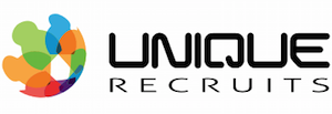
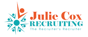
Combination Mark
A combination mark incorporates a symbol and a wordmark in a single logo. If you look across the spectrum of business, you will find that this choice is popular as the logo can be used in full or the wordmark or symbol can be separated and used on its own. If you design this type of logo properly, the logo can look as good together as it does in its components. This recruitment logo is easily the most popular logo in the industry.

Wordmark
A wordmark is an all-text logo, often designed in an original font that was created specifically for the brand. In recruiting, you will rarely find a company that has the budget for a custom font but you will frequently find word marks in everyday fonts as they are always appropriate for a professional services business.

Symbol or Icon
When people think of a logo, they often picture some of the most iconic symbol logos such as Apple and Shell. These types of logos are often considered to be bold and it is easy to see how you can build a recruitment agency brand around them. For a recruiter without a massive marketing budget, it is can be difficult to design a compelling symbol recruitment logo that stands the test of time, which is why they are not that common in the industry.


Are you looking for recruitment logo design services for your business? Click this link to contact Talent Hero and get started on building a beautiful logo for your business. We’ll design a timeless logo for your business that will make you stand out in a crowded market.
Lettermark
A letter mark is like a word mark but with a shortened version of the company name. Companies like HP and GE are two of the most universally recognizable and when you sound out their full names, you’ll see why they prefer the abbreviated versions. Many recruiting companies that were once known by an unwieldy name have shortened their recruitment logo to a lettermark for ease of pronunciation and to create a more visually powerful first impression.

Emblem
An emblem is a type of logo that incorporates the name of the business directly into an abstract design concept. It’s uncommon in the recruiting world as it often comes across as too flashy and in your face. In fact, we couldn’t even find a single example of this logo used in recruiting but you can check out Starbucks if you want to see an example.

