When it comes to designing a recruitment website, there is no rule book. As you might expect, most recruiter sites therefore tend to look different and have varied content. More importantly, they tend to have different levels of effectiveness.
While there is no need for every recruiter site to be the same, there are tried and tested elements that every site should have.
These six concepts should be implemented on every recruiting business site to take full advantage of the marketing potential of your web presence.
Bonus: Want to skip the article and get straight to the point? Download our free 11-step website checklist for recruiters.
A clean and professional site design
To make a great first impression, your site should be professionally designed and visually appealing.
Why? The average visitor takes about three seconds to decide whether they are going to stay on the site and explore and if you don’t wow them from that first second, you aren’t going to have the opportunity to show them anything else.
While there is no single approach to a well-designed recruitment site, there are certainly a few things you want included, many of which are well-represented on the site of Groom & Associates. [Note that I have no connection with this company and I am featuring them here solely because they have built a great-looking site.]
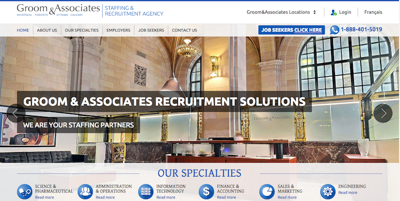
They have an easy to follow navigation structure that allows both employers and job seekers to find what they’re looking for quickly. They have great graphic design elements, including custom-designed icons that are used to represent their different specialties. They use fresh and exciting images to liven up the page. Finally, the site looks great on mobile.
If you were to find this site cold, your confidence in their brand would instantly increase because their site exudes the message that they are on top of their game.
Search engine friendly structure
No matter how professional and well-designed your recruiter site looks, it will make no difference if the site doesn’t have any traffic.
To ensure that your site reaches the broadest audience possible, it must be optimized for search.
In short, you need to ensure that each page has the following elements:
- A unique page title
- A unique meta description
- Written content that contains the keywords that people looking for your site in Google will use
In addition, you should also link between pages on your site so that Google can learn about how different topics relate to one another.
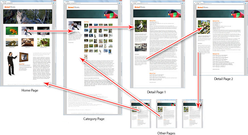
How interlinking pages works
To learn more about optimizing your site (also called on-page SEO), read our post on ranking higher in Google.
An optimized job board
While it would seem obvious that a job board would be a part of every recruiter’s site, I am still amazed at how many I visit that are missing this critical component.
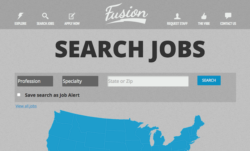
An optimized job board
A properly optimized job board serves three core functions.
First, it diversifies your candidate pool. By making your jobs available on your site, you encourage more people to apply and can therefore offer your clients a broader pool of candidates for interviews.
Second, it offers you increased credibility. When you enable a job board that has a significant numbers of jobs, anyone visiting the site will automatically understand that you’re a big player and be more likely to work with you.
Third, it increases search traffic. When you have a range of jobs posted, there are more keywords that will lead to your site when candidates and clients search for terms of interest. All things being equal, a site with more jobs is going to get more search traffic than a site with fewer jobs.
Testimonials
Testimonials are crucial because they sell your brand in a way that you cannot. However, testimonials are tricky since most of them suck.
A testimonial that reads like your company’s marketing copy will not add any value to your business since people will tend to discount them in the same way they discount any bragging you do about yourself.

An example of a bad testimonial
So how do you get testimonials that don’t suck?
There actually is one simple trick. Get quantitative!
Instead of asking your customers to simply write a testimonial, ask them for one or two quantitative ways in which you helped them.
Take those quantitative benefits, use them to write a testimonial on behalf of the client and get the client to sign off on the final language. You will instantly have testimonials that sell.
Let’s examine a hypothetical using both the standard and quantitative approaches. With the standard approach, you get a testimonial that reads as follows: “I loved working with the team at Recruiter X. They always go the extra mile to answer my questions quickly and find the perfect candidate for my team. I can’t recommend them enough.”
With the quantitative approach, the customer tells you that the fact that you consistently find them a list of five solid candidates in under a month is why they keep coming back. With that information, you write the following testimonial: “I keep coming back to Recruiter X because they consistently provide me with five solid candidates within 30 days. This sets them apart from the other firms I’ve used and demonstrates their true value.”
See the difference? With just a small tweak to how you ask for customer feedback, you have access to a testimonial that sells and will increase the trust that is built with visitors to your site.
Well-written and up-to-date content
There is nothing that says amateur hour like visiting a site riddled with grammar and spelling errors.
When you don’t pay attention to the details on your site, it sends the message that you probably don’t pay attention to detail elsewhere. Clearly, that is not what you want to convey.
Furthermore, you send a similar message when your site’s content is out-of-date. If you want to blog as part of your marketing strategy, don’t let your blog languish. When I come to a site and see that a blog hasn’t been updated in six months, I’m not sure how I can expect I will receive timely attention when it comes to my own needs as a customer.
Tools for building an email list
When a visitor comes to your site, especially from search, the most likely outcome is that they read a blog post and leave. From a customer acquisition perspective, this is a disaster.
While you can always try to retarget them, the better option is to try and capture their e-mail address.
You can do this in a number of ways.
- Add bonus content to your post that is only accessible after the visitor provides their contact information.
- Include pop-ups and smart bars throughout the site so that people have an opportunity to sign up for your newsletter. I would recommend Sumo as a good free option that we also use on this site.
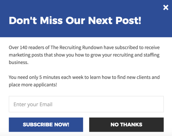
A pop up used on this site
![]()
A smart bar used on this site
- Have a landing page that offers a high-value giveaway in exchange for contact information. On Talent Hero’s site, we use the Recruiter’s Guide to Online Marketing for this purpose.
Make sure you do it all
Every component of your recruiter site plays a part in creating a well-oiled lead-building machine designed to help inspire confidence in your brand. Make sure you take the time to do everything you can to build a site with these six essential elements.
Don’t have time to build your own perfect website? Contact Talent Hero and we’ll build you a beautiful and functional website that actually helps you land new business.


