Talent Hero

Website Design For Recruiters:
The Ultimate Tutorial

Whether you’re creating a new recruitment website from scratch or are looking to update an existing one, you want a design that’s both attention-grabbing and effective. This ultimate tutorial has all the tips that you need.

If you want to:

  • Understand the principles of good website design
  • Learn how to write engaging copy
  • Find out how social proof can work for you
  • Leverage your subject matter expertise
  • Stand out from your competitors
  • Use your website to generate leads who will turn into loyal clients and candidates

Then this tutorial will provide you with everything you need for your toolbox.

Are you ready to dive in?

Let’s go.

Website Design For Recruiters Banner

Contents

Section 1

Why Does Good Design Matter?

In this section, let’s explore:

  • The impact of a well-designed website
  • Why poorly-designed websites are a conversion killer
  • How well-designed websites encourage leads to become clients
Why Does Good Design Matter@2x

The Impact Of A Well-Designed Website

It’s true: a good website can make or break your business. Studies show that visitors will simply leave your site if it isn’t well designed.

But what exactly does “well-designed” mean?

In the past, websites were about establishing presence. They presented information about a company and hoped that visitors would get in touch.

Over time, website design changed.

Today, well-designed websites use visually-appealing pages and optimized performance to increase your conversion rate, generate leads, and ultimately improve your bottom line.
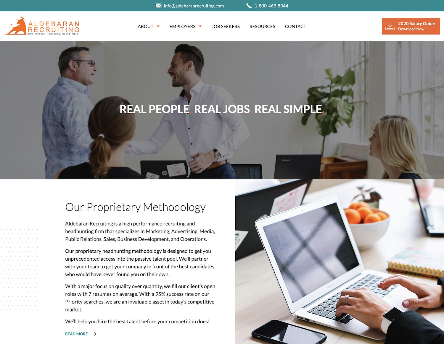
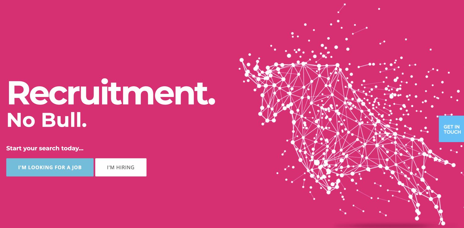
01 example of high quality recruiter web design

How do they do that? A well-designed website:

  • Makes a great first impression by being visually appealing
  • Is easy to use and navigate
  • Presents all the information needed by leads in a minimum amount of space
  • Improves your credibility and the amount of trust that visitors place in you
  • Has solid backend coding
  • Make you stand out from the competition

Good website design is more important than ever.

Most people rely on their own research when making decisions. And, in 2021, a lot of that research is done online.

In fact, it’s fair to say that almost every lead will check out your website in order to learn more about your business.

If your website is poorly designed, they will simply leave.

Poor Design = Low Conversion

First, let’s talk about what a conversion is.

A website typically invites some kind of action, such as:

  • Purchasing a product or service
  • Signing up for a workshop
  • Reading a blog post
  • Requesting more information or a consultation call
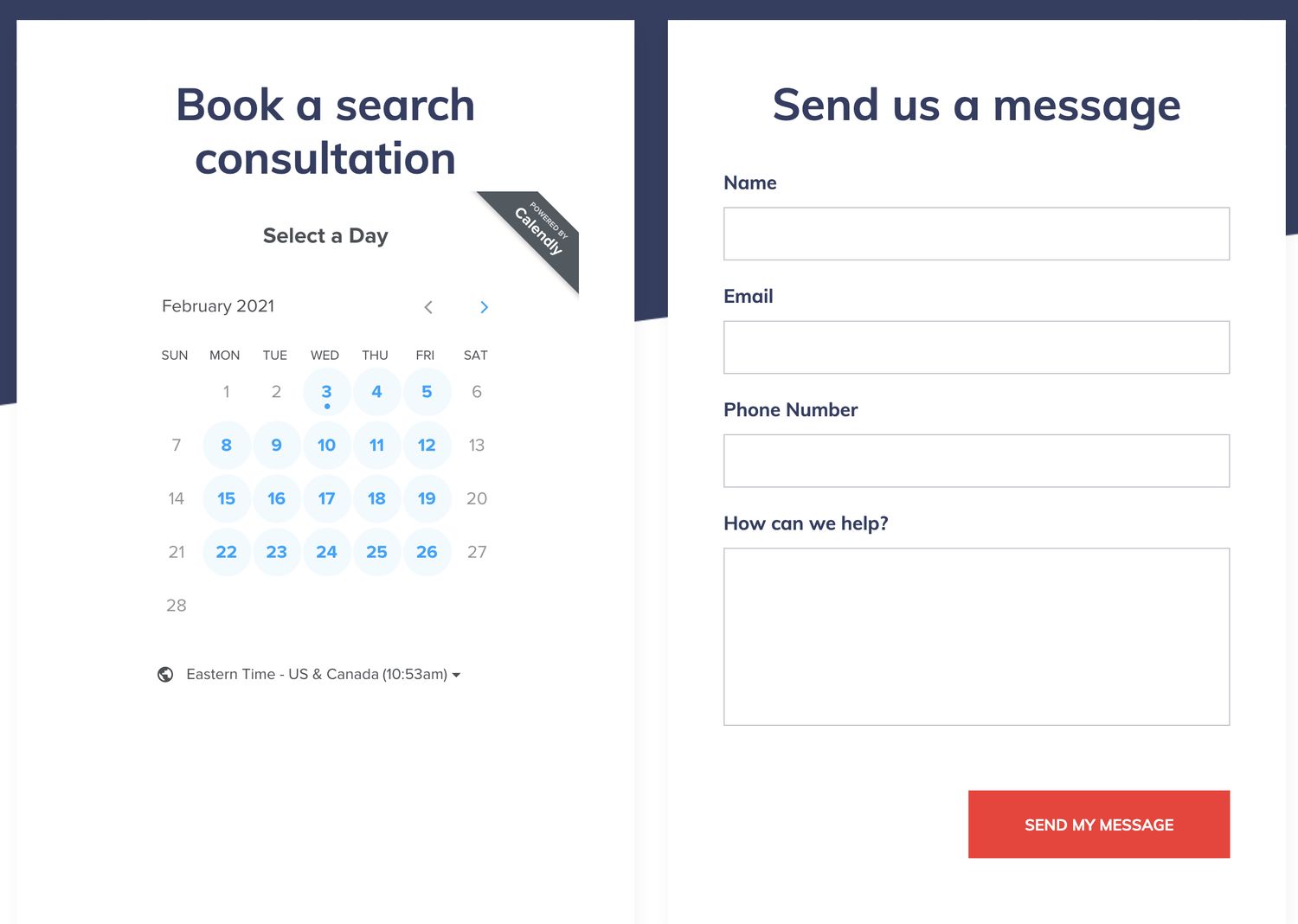
02 contact

When a visitor follows through with one of those actions, it’s called a conversion.

The conversion rate is the number of visitors who complete your website’s desired action.

A well-designed website is crucial to a high conversion rate.

A piece at sweor.com reports that it takes only 50 milliseconds (that’s 0.05 seconds) for a visitor to decide if they will stay to browse your website.

Of those who do stay, 38% will stop engaging if the site isn’t visually appealing.

As well, 8 out 10 will stop engaging if the content doesn’t display well.

If visitors are leaving because of poor design, your conversion rate will obviously be low.

Good Design = Loyal Clients and Candidates

A well-designed website encourages visitors to stay and engage.

And once a visitor engages, following through with the desired action in your conversion process, that visitor becomes a lead.

A lead is someone who has the potential of becoming a client or a candidate.

As part of your conversion process, a hiring organization might:

  • Look for your phone number in order to give you a call
  • Use a form on your website to schedule a call with you, in order to discuss their hiring needs
  • Send an email inquiry, either by using a form or following a link
  • Request a document download, such as a salary guide or whitepaper, by providing their email address, which you can use to follow up with them later

A potential candidate might:

  • Follow a link in order to submit a resume
  • Check your job board and apply directly for a position
  • Seek your contact information if they have questions for you
03 nav bar

They key to converting visitors into loyal clients and candidates begins with a compelling, engaging, and well-designed website.

Website Design For Recruiters: The Ultimate Checklist

When you’re ready to re-do your site, our handy checklist will guide you on your journey to recruiting website perfection.

Section 2

Compelling Design

Compelling design is visually-appealing design.

As a blog from EZMarketing points out, “science and psychology support the idea that we are drawn to beautiful things, and people inherently react to good design.”

Compelling design also takes the speed of the site into consideration.

After all, no matter how beautiful a webpage may look, if it’s slow to load or difficult to navigate, visitors will simply leave.

Both the visual and speed aspects of website design affect your conversion rate.

Compelling Design@2x

In this section, let’s focus on the visual aspect only.

Let’s talk about what separates visually good design from visually bad design, including:

  • Balanced use of space
  • Bite-sized chunks of text
  • Well-chosen photos
  • Appealing use of colour

Balanced Use of Space

The layout of a page has a big impact on its visual appeal.

Don’t be afraid of blank space.

04 example of whitespace

Astute use of white space between text and photos will give your page a spacious, well-balanced feel.

Bite-Sized Chunks Of Text

Keep your text bite-sized and well-spaced for easy consumption.

05 example of text layout

Most readers tend to scan websites for easy-to-pick-out information.

In fact, studies show that only 16% of visitors to a new website will read all the text word-for-word. Almost 80% of a website’s new visitors simply scan the page.

The Nielsen Norman Group suggests accentuating your key text points by:

  • Highlighting keywords
  • Using meaningful subheadings
  • Incorporating bulleted lists
  • Focusing on one idea in each short paragraph
  • Putting your most important point – traditionally your conclusion – at the top
  • Striving to cut your word count in half

Well-Chosen Photos

A key part of a website’s visual appeal is, well, its visuals.

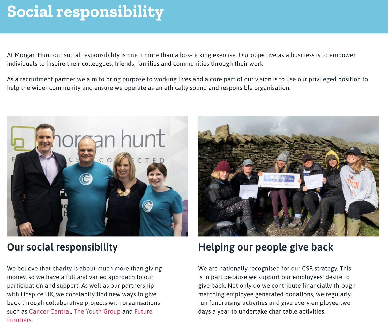
Choose beautiful and – most importantly – meaningful photographs.

06 candid photos

While stock photos are a quick and easy way to add well-composed images to your website, visitors can easily distinguish between stock and real photos.

And, frankly, stock photos come across as inauthentic and diminish your credibility.

Visitors want to see honest representations of your business, including your own staff, work space, and company culture.

Using real photos can have a significant impact on your conversion rate.

For example, a piece at Blue Compass discusses a study where real photos resulted in a 35% increase in a site’s conversion rate, as compared to when that same site used stock photos.

If your budget allows, hiring a professional photographer will pay off in the long run.

But even a clear, meaningful image taken with your cell phone camera can have a bigger impact on your credibility and conversion rate than a stock photo.

Appealing Use of Colour

Colour has a huge impact on the way visitors assess your site.

Using your brand colours is an excellent way to increase brand awareness.

But, as a piece at The Daily Egg points out, colour is about more than aesthetics or branding. Certain colours are optimal for marketing specific types of products and services.

07 use of colour

Given all the colour options, and the meanings behind them, choosing your website’s colour scheme might seem overwhelming.

To start, just go with colours that appeal to you. It’s easy to change the HTML colour codes down the road if your initial choices aren’t testing well.

Section 3

Engaging Copy

Writing engaging copy for websites is different from writing text for print.

Not only should you format your copy differently but you should seek to answer very specific questions.

In this section, let’s take walk through the differences between copy that is:

  • Online vs print
  • Specific vs vague
  • Engaging vs dull
  • Helpful vs unhelpful
    Ready to dive in?
Engaging Copy@2x

Online vs Print

People read online material differently than text printed on paper. They tend to skim online content for markers like headings/subheadings, hyperlinks, bullets, and keywords.

08 use of headings

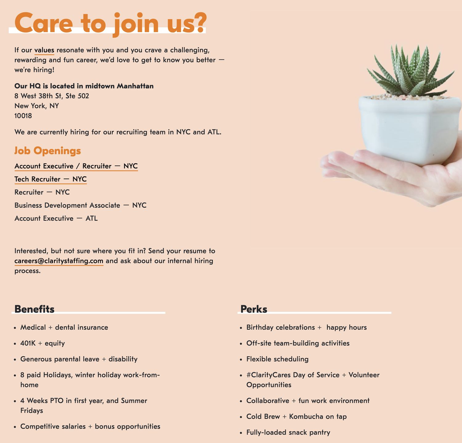
And particularly when people read on mobile devices with small screens, it becomes difficult to digest large chunks of text.

When writing online copy:

  • Keep words, sentences, and paragraphs short
  • Eliminate fluff and stick to the point
  • Write the way you talk by keeping it informal and getting rid of jargon
  • Help readers skim your content by using headings/subheadings, hyperlinks, and bulleted lists
  • Keep SEO keywords in mind
  • Proofread

Even if you’re an excellent (or professional) writer, a second set of eyes can often pick up small issues like double spaces or missing punctuation.

Specific vs Vague

People visit your website in order to find out more about your company. Be proactive and give them the information they’re looking for.

Help visitors decide that you are the best fit to work with.

Typically, visitors look for:

  • The specific tasks that your company undertakes
  • The areas that your recruiting agency specializes in
  • The benefits to working with you, especially when compared to your competitors
  • The things that you do differently from other companies
  • The qualities of your company that makes it stand out as truly unique
09 use of differentiators

Engaging vs Dull

Great copy grabs people’s attention and makes them want to continue reading.

Think about a great storyteller that you know. How does that person grab your attention and keep it?

First of all, keep your tone conversational and informal. Formal writing doesn’t invite approach or engagement.

Also, let’s face it: formal writing is boring. If your copy is boring, few people are going to stick around to read it.

Second, appeal to your visitors’ emotions. Great stories often hinge on great emotion.

010 use of emotion

How can you evoke emotion on a recruiter’s website? Think about telling stories that:

  • Celebrate a client’s success
  • Encourage faith in your strengths
  • Evoke excitement for the things you do that no one else does
  • Empathize over things like the finding the perfect work-life balance

Decision-making also often hinges on emotion. Help visitors decide to follow through with your conversion process by evoking emotion in your copy.

Helpful vs Unhelpful

There are three specific questions that every website should answer.

1. Who Are You?

Visitors often want to know very specific things about you.

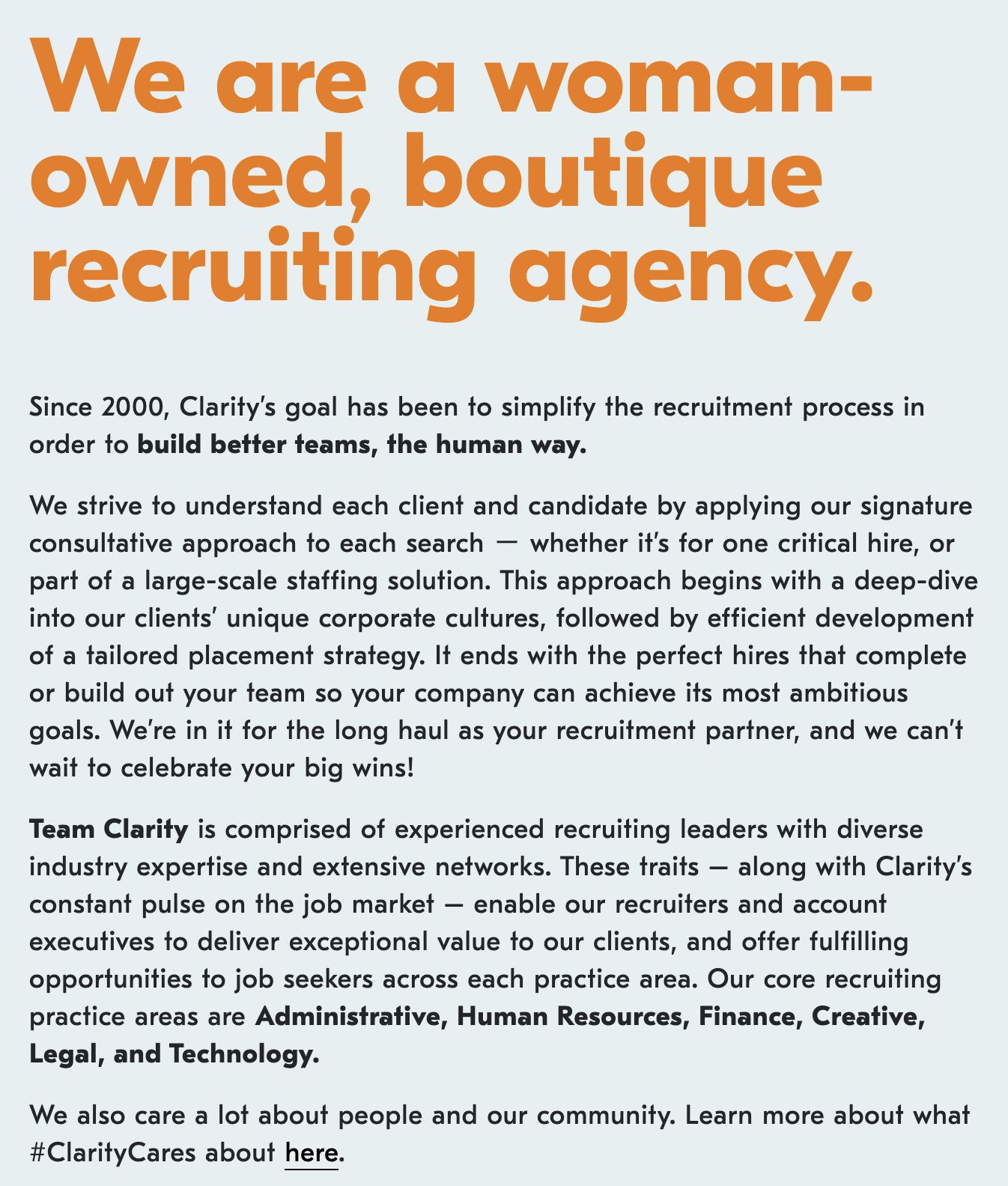
What do you specialize in? Where are you physically located? Which geographic areas do you serve? Who works for you and what are their roles?

011 meet the team

Creating strong About and Team pages is crucial to letting people know who you are.

2. What Value Do You Bring?

Visitors and even leads are still making the decision about whether to work with you.

Entice them by letting them know what benefits you, specifically, can offer to them.

3. What Makes You Different?

What do you do differently than your competitors? What do you offer clients that no one else does?

Give visitors and leads a reason to reach out and connect with you.

Website Design For Recruiters: The Ultimate Checklist

When you’re ready to re-do your site, our handy checklist will guide you on your journey to recruiting website perfection.
Section 4

Social Proof

Social proof is a psychological phenomenon. It’s the theory that people look at the actions of other people to determine what they themselves should do.

Looking at restaurant reviews to help decide what to order is a terrific example of social proof in action.

On a recruiter’s website, social proof might include:

  • Client logos
  • Testimonials
  • External reviews
  • Case studies

Let’s look at each of these a little more closely.

Social Proof@2x

Client Logos

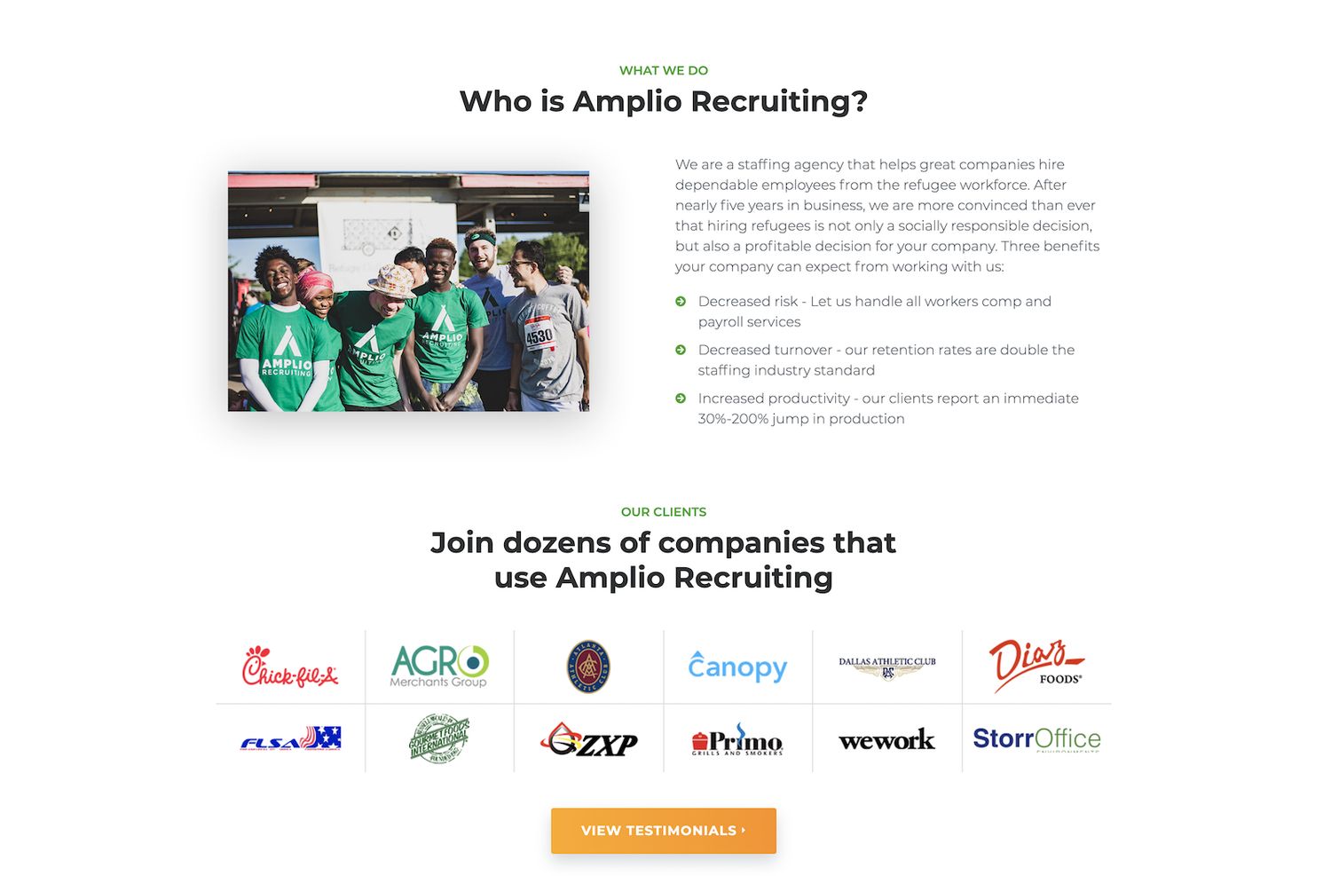
Including logos of clients who have chosen to work with you – especially if they are well known companies – is a terrific way to add social proof and increase your credibility.

012 client logos

When visitors see the logos, they’re apt to think, “If this recruiter works with those businesses, they must be a top-notch recruitment company!”

Sprout Social reports that adding client logos has been shown to increase website conversions by a whopping 400%.

Some recruiters are reluctant to include client logos, thinking that posting their client lists will give other recruiters a chance to poach their clients.

Nothing could be further from the truth.

First, your competitors aren’t scanning websites to find clients to poach.

Second, if your clients can be that easily poached, you have bigger issues to worry about.

Testimonials

Testimonials are an extremely powerful form of social proof.

According to a piece at OptinMonster, “92% of people will trust a recommendation from a peer, and 70% of people will trust a recommendation from someone they don’t even know.”

OptinMonster also reports that testimonials can increase website conversions by as much as 34%.

What exactly is a testimonial though?

A testimonial is similar to a review in some ways. It’s a statement from a customer about the company and/or its services.

013 testimonials

The difference is that a testimonial is gathered by the company and used at their discretion.

It would be unusual for a company to incorporate a negative testimonial into their website.

Instead, testimonials are cherry picked to showcase the company in its very best light.

External Reviews

Unlike testimonials, external reviews are independently submitted and can be either positive or negative.

Reviews are often posted on an open platform, like Google or Facebook, where the company isn’t able to filter out or delete poor reviews.

You can embed these reviews on your website.

014 external reviews

Allowing bad reviews to be listed on your website, as part of an embedded review feed, can be a bit scary.

After all, some clients can be impossible to please, no matter how hard you try.

But there is a benefit to showing how you respond to a poor review.

If you follow up to acknowledge the review and offer to make things right, it shows you in a positive light.

It’s actually a good idea to respond to all reviews, whether they’re positive or negative. A blog piece by Qualtrics reports that 89% of those scanning reviews will read a company’s responses.

And, if you have confidence in your company’s performance and relationships, you can always encourage clients to leave reviews. A plethora of positive reviews will help to drown out any negative ones.

Case Studies

A case study gives you a chance to highlight your success stories in your own words, and at a longer length, than most testimonials or reviews.

Typically written in three parts – problem, solution, and successful outcome – a case study is one of the most powerful types of social proof.

015 case study

The length and depth of a case study allows visitors to gain a deeper understanding of your company and its strengths and values than either testimonials or reviews.

Section 5

Subject Matter Expertise

Most people who visit your website are there to do some research and decide if you are the best fit for their needs.

In addition to compelling design, engaging copy, and social proof, subject matter expertise helps people make that decision, ultimately increasing your website conversion rate.

When you establish yourself as a subject matter expert (SME), you showcase your professionalism and credibility, and that, in turn, creates trust.

Subject Matter Expertise@2x

There are a number of ways that you can demonstrate your subject matter expertise, including:

  • Salary guides
  • Whitepapers
  • Blog posts

Are you ready to find out more about each of these?

Let’s get started.

Salary Guides

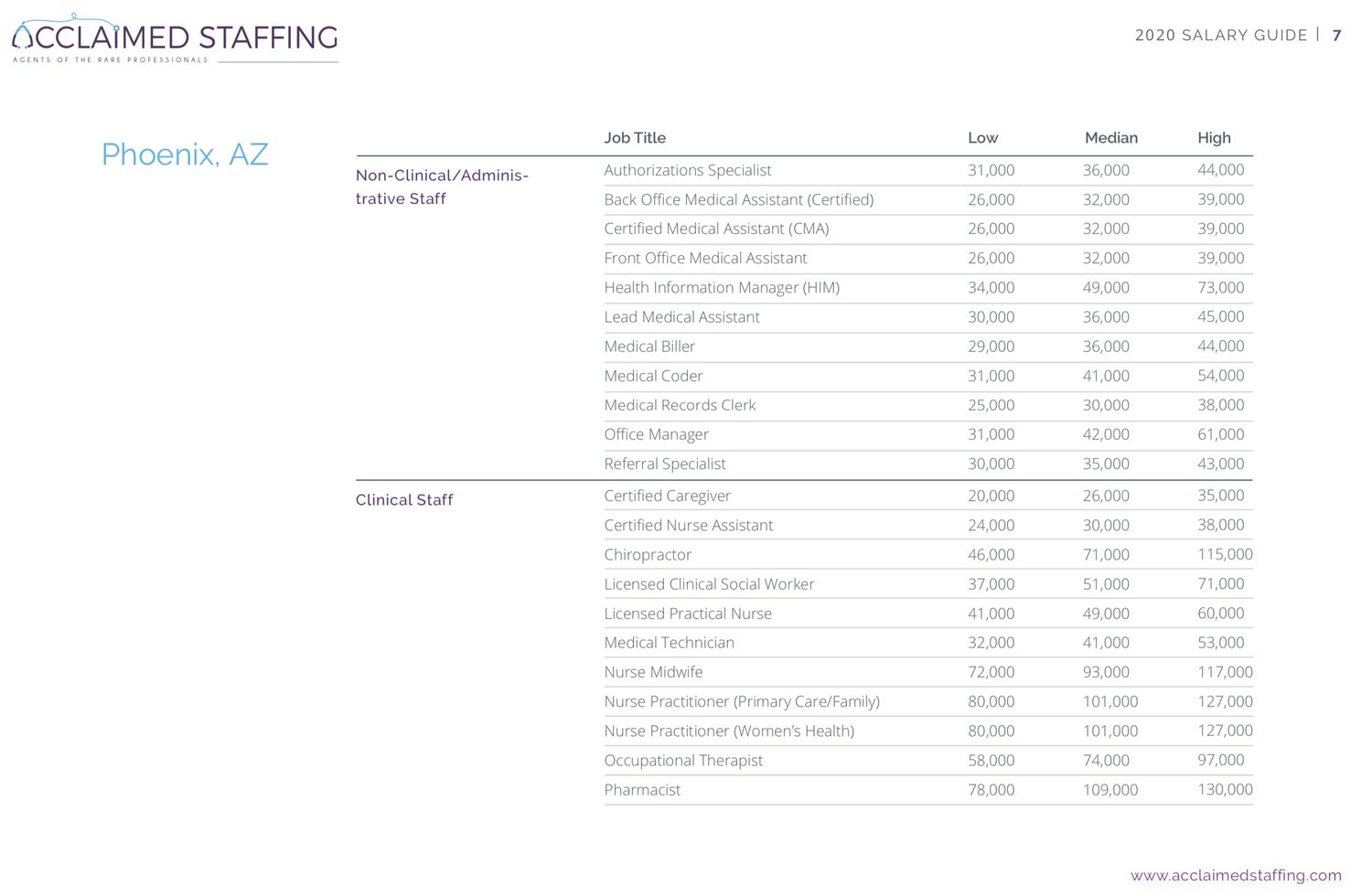
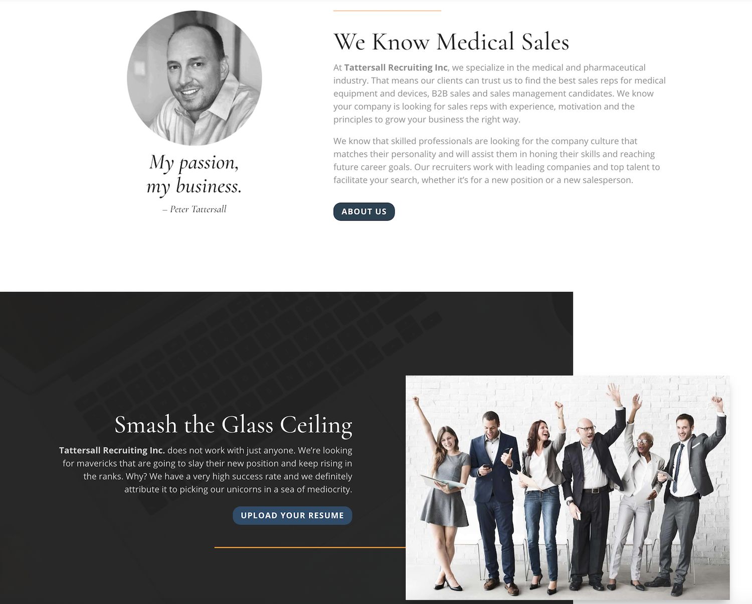
A salary guide can only be written by someone with in-depth knowledge of an industry’s job opportunities, pay scales, and market trends.

A lengthy guide from the Society for Human Resource Management (SHRM) lists the steps involved in creating a salary guide and it is a complex project.

016 salary guide

As a recruiter, knowledge of pay scales is a crucial part of your role.

Why not share that knowledge as a way of establishing subject matter expertise?

Whitepapers

A whitepaper is a lengthy problem-solving guide that discusses a specific issue and provides a solution to it.

017 whitepaper

Whitepapers assume a certain level of expertise in their audience and are often complex and full of technical language.

It shouldn’t be a surprise, then, that a whitepaper is an effective way of establishing you as a SME.

But, in order for a whitepaper to increase your conversion rate (perhaps by inviting visitors to download a PDF copy), it needs to appeal to your audience.

Think about potential clients who are visiting your website. What sorts of problems do they have that could be addressed in a whitepaper?

Since you have an excellent understanding of your client base, and why they are seeking your services, it shouldn’t be difficult to determine an effective topic.

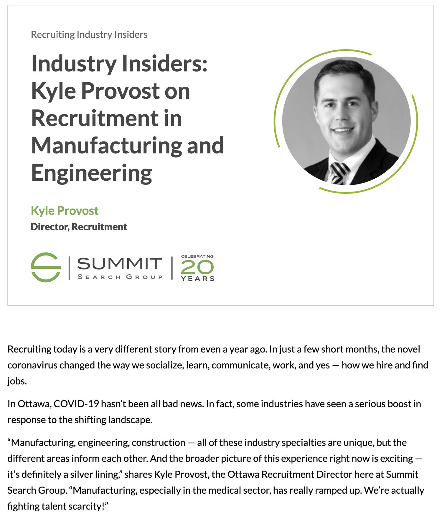
Blog Posts

A blog post is another way to show off your subject matter expertise.

018 blog

The nice thing about blog posts is that they’re easier to write than salary guides and whitepapers. They’re typically:

  • Shorter
  • More informally written
  • Not research-heavy

Additionally, blog posts that resonate with your audience are often shared on social media, generating new visitors to your website.

In order to be the most effective, these blog posts shouldn’t be on a general topic that any content creator can write about.

Effective blog posts should address a very specific niche that you have expert-level knowledge in.

As a recruiting company, you are already a SME. Why not leverage that to increase your website conversion rate and gain new clients?

Website Design For Recruiters: The Ultimate Checklist

When you’re ready to re-do your site, our handy checklist will guide you on your journey to recruiting website perfection.

Section 6

Job Board Integration

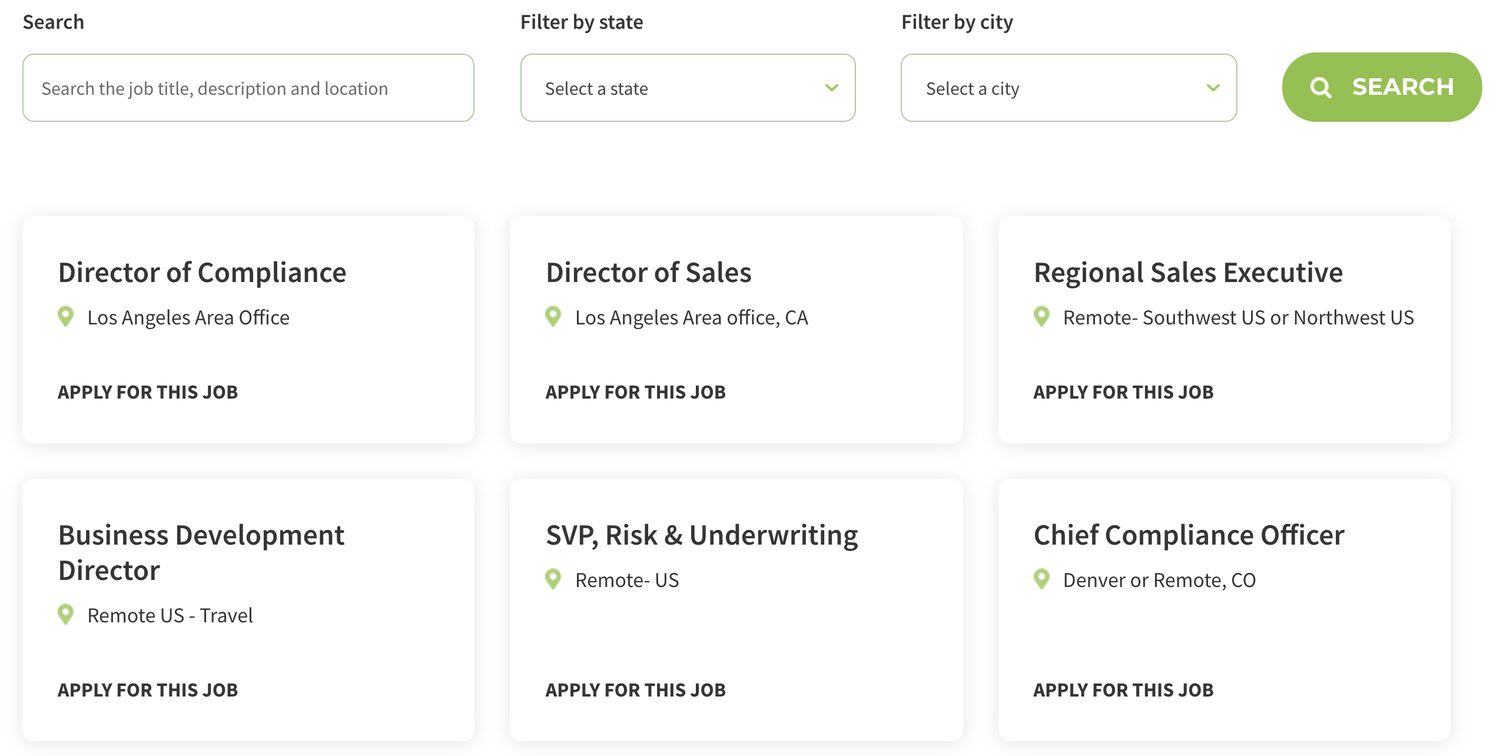
A job board is crucial to any recruiting website as it shows that you’re actively working as a recruiter.

A job board is also an excellent tool for attracting visitors to your website, and for converting those visitors to leads.

Job Board Integration@2x
019 job board

It’s most time-efficient and cost-effective for you if your job board is linked to an applicant tracking system (ATS). This will allow you to add your jobs only once (in your ATS) and have them automatically appear on your site.

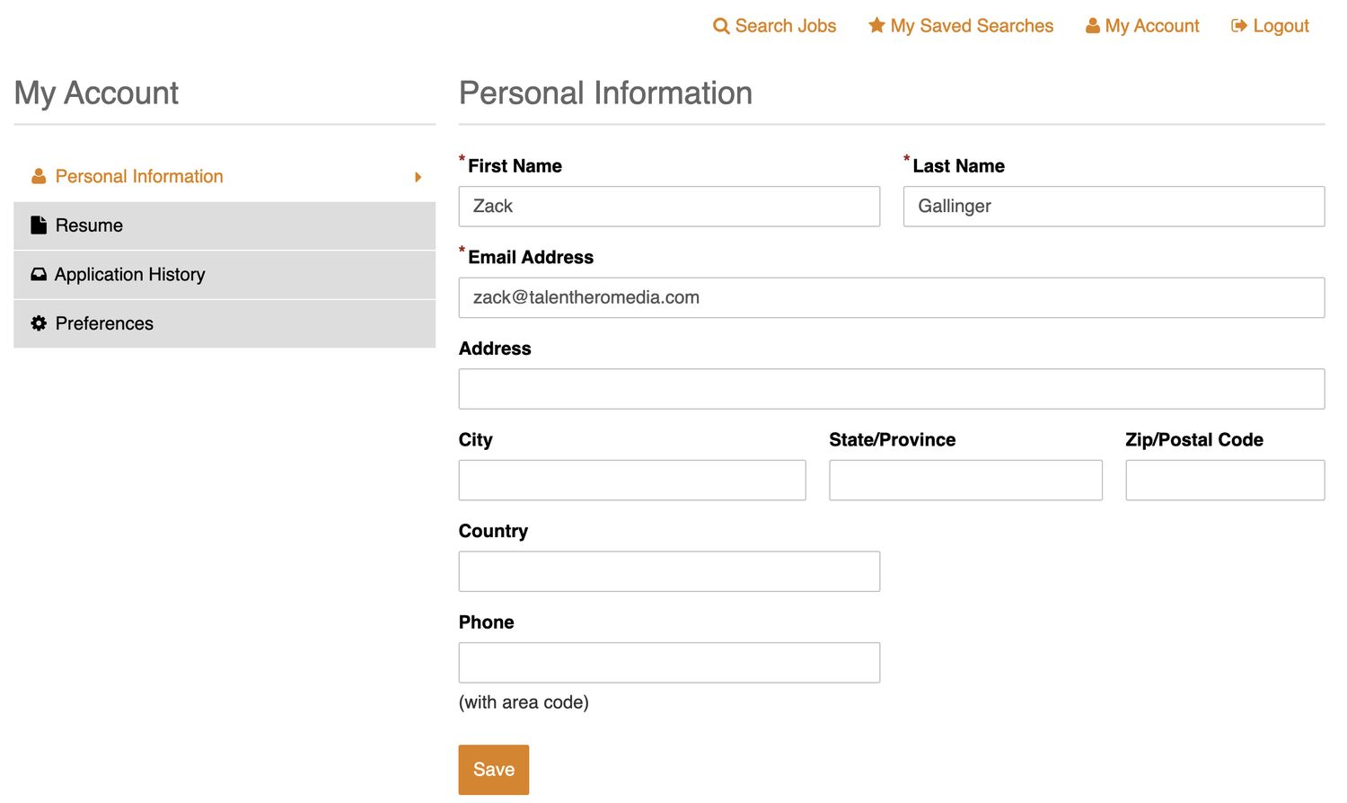
An effective job board will also have a candidate portal so that job seekers can upload a resume and apply to multiple jobs with a single click. They can also see past jobs they applied for and be notified when new jobs that match their preferences are added.

020 candidate portal

A job board that’s linked to an ATS drives traffic to your website, develops leads, and increases your credibility. In short, it’s a must for any recruiting website.

Conclusion

I hope my new Website Design For Recruiters tutorial was helpful to you.

I’d welcome hearing your own thoughts about what I’ve discussed.

Which tip are you most likely to incorporate first?

Let me know by leaving a comment below.